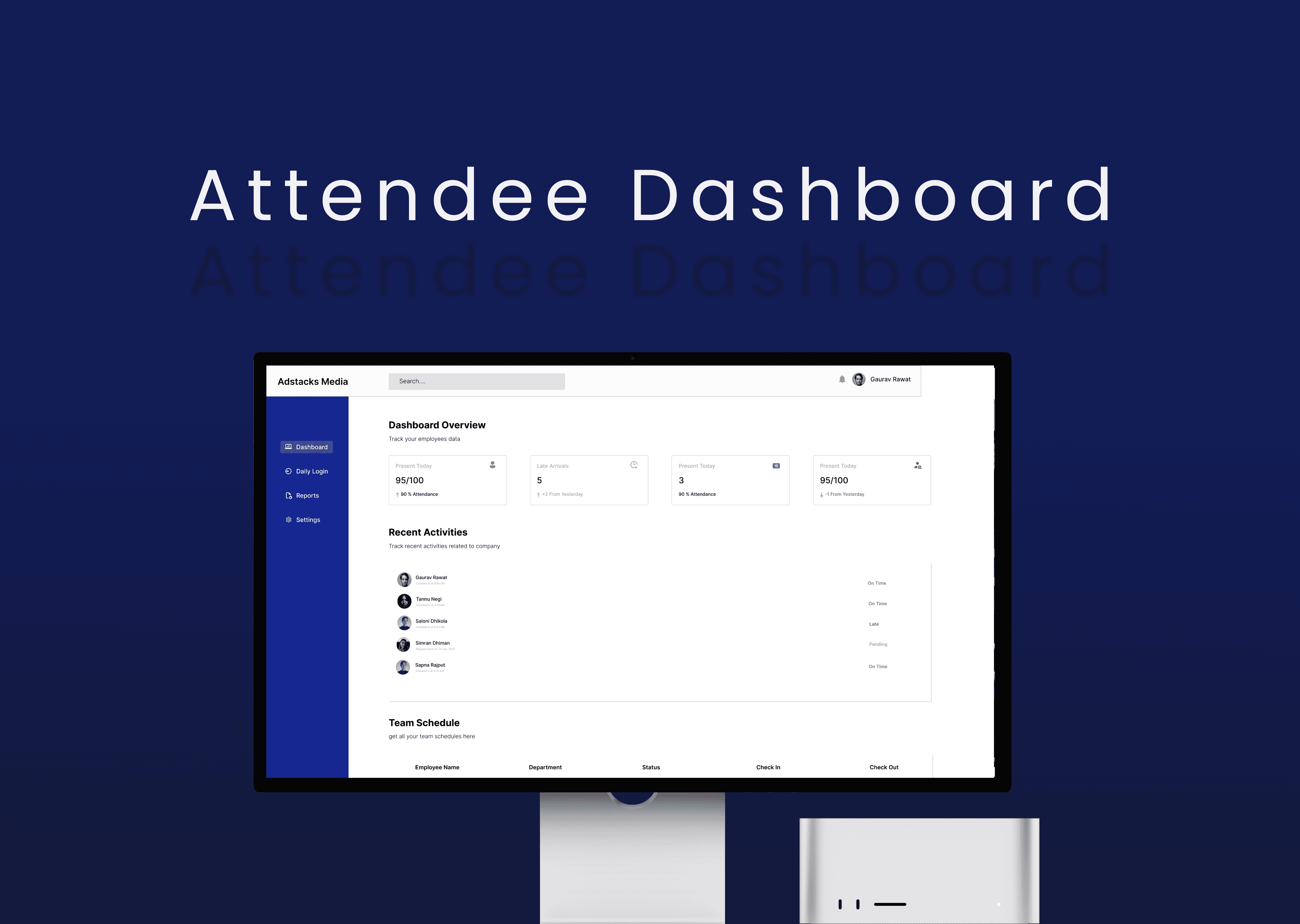
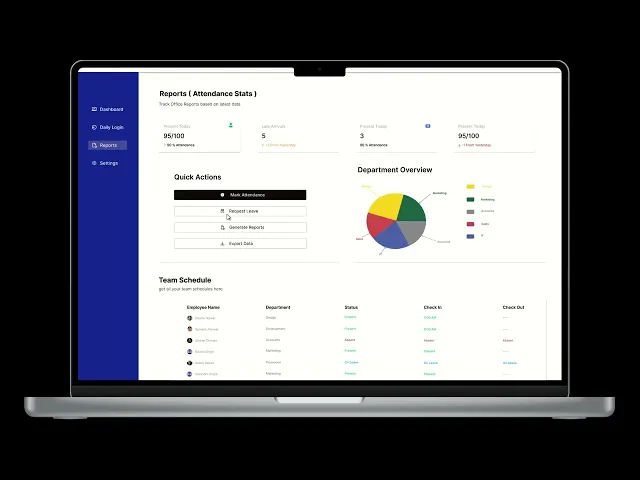
Designed a dashboard experience as part of a design task for Adstack Media to explore how employee attendance data can be structured and visualized for better usability and quick decision-making. This task focused on creating a clean and functional dashboard layout without relying on real data or existing product constraints.
Website
2 Days
UX/UI Designer
Concept / Assignment
Figma, Notion & chatgpt
Overview
The goal was to design an interface that allows users to monitor attendance, review daily logs, and understand overall team activity with minimal effort. Emphasis was placed on simplicity, hierarchy, and usability.
Problem
Tracking attendance across teams can become difficult when data is scattered and not easily readable, leading to delays in identifying issues like absences or late entries.
Solution
Dashboard Overview
Displays attendance metrics and daily summaries
Highlights recent activity for quick updates
Uses card-based layout for fast scanning
Screens
Dashboard Overview
Presents key attendance metrics along with recent activity, allowing users to quickly understand the current status without navigating deeper.
Reports & Insights
Displays summarized attendance data with visual support, helping users identify patterns and access important actions from one place.
Daily Login Log
Provides a structured table of attendance records with clear status indicators, making it easy to track individual activity.
Settings
Includes user preferences and system configurations, organized into clear sections for better usability and control.
Key Decisions
The design prioritizes important information at the top to support faster decision-making. A card-based layout is used to break down complex data into smaller, readable sections. Color is applied selectively to indicate status, avoiding unnecessary visual noise. Consistency in spacing and alignment helps maintain clarity across all screens.
Outcome
The result is a clean and structured dashboard concept that demonstrates the ability to organize information effectively and design for real-world usability, even within a limited-scope task.


Future Scope
This dashboard can be further improved by adding advanced filters, drill-down insights, and time-based analytics to move beyond static data. Real-time alerts, leave management, and payroll integration can evolve it into a complete workflow system, while better responsiveness would ensure usability across devices.
Conclusion
This design demonstrates the ability to structure and present complex attendance data in a clear and usable way. Even without real data or research, the focus remained on hierarchy, clarity, and efficiency. The outcome is a functional dashboard concept that highlights practical UI/UX thinking and the ability to design for real-world admin workflows.