Empowering Runners Beyond Run with Marathon+

Marathon+ is an engaging, user-friendly digital platform for a virtual marathon event, enabling participants to register, track progress, and receive updates seamlessly from anywhere.

Platform

Platform

Ios and Android Mobile

Duration

Duration

3 Months

Industry

Industry

Fitness/Healthcare

Role

Role

UX/UI Designer

Team size

Team size

5+

Tools

Tools

Figma, Canva, Miro, clickup, chatgpt

Problem Statement/ Challenge

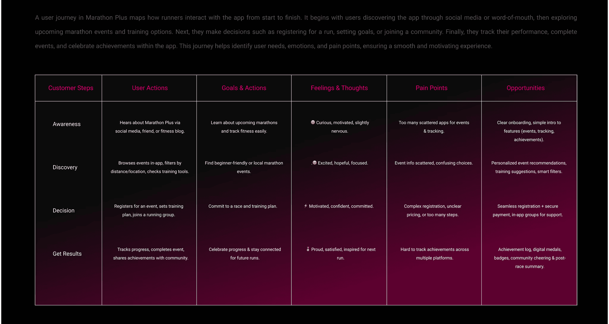
Existing running apps focus primarily on tracking runs, but marathon enthusiasts seek deeper engagement. They want detailed performance insights, community interaction, and easy access to gear.

Solution

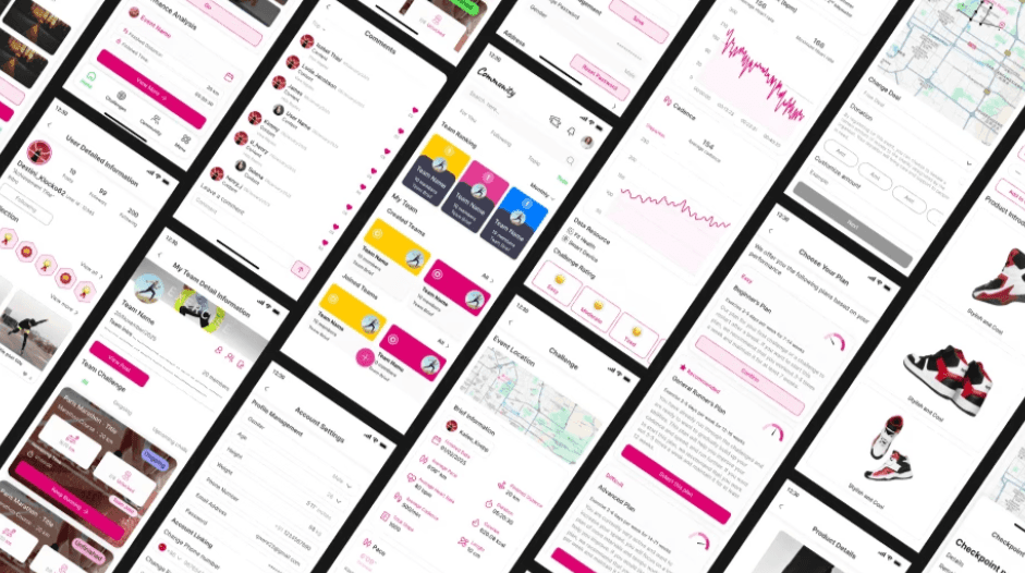
Marathon+ is a mobile app for marathon runners, blending performance data, community, and in-app gear purchases. Beyond tracking runs, the app offers detailed stats like heart rate trends and includes a community section where runners can share experiences. It also has an in-app store for marathon gear. The app supports both dark and light modes, with pink as the primary color.

Target Metrics

While not yet launched, Marathon+ is designed to drive runner engagement through richer data, community interaction, and integrated commerce. It aims to keep users motivated, connected, and equipped for their next marathon.

25%+

Engagement: target active users

40%+

30 day retention target

5%

In App sales conversion from the gear store

In App sales conversion from gear store

Process

Research & Analysis: I conducted competitor analysis with apps like Nike Running, Strava, and Adidas Running, and studied industry trends to understand user pain points and needs.

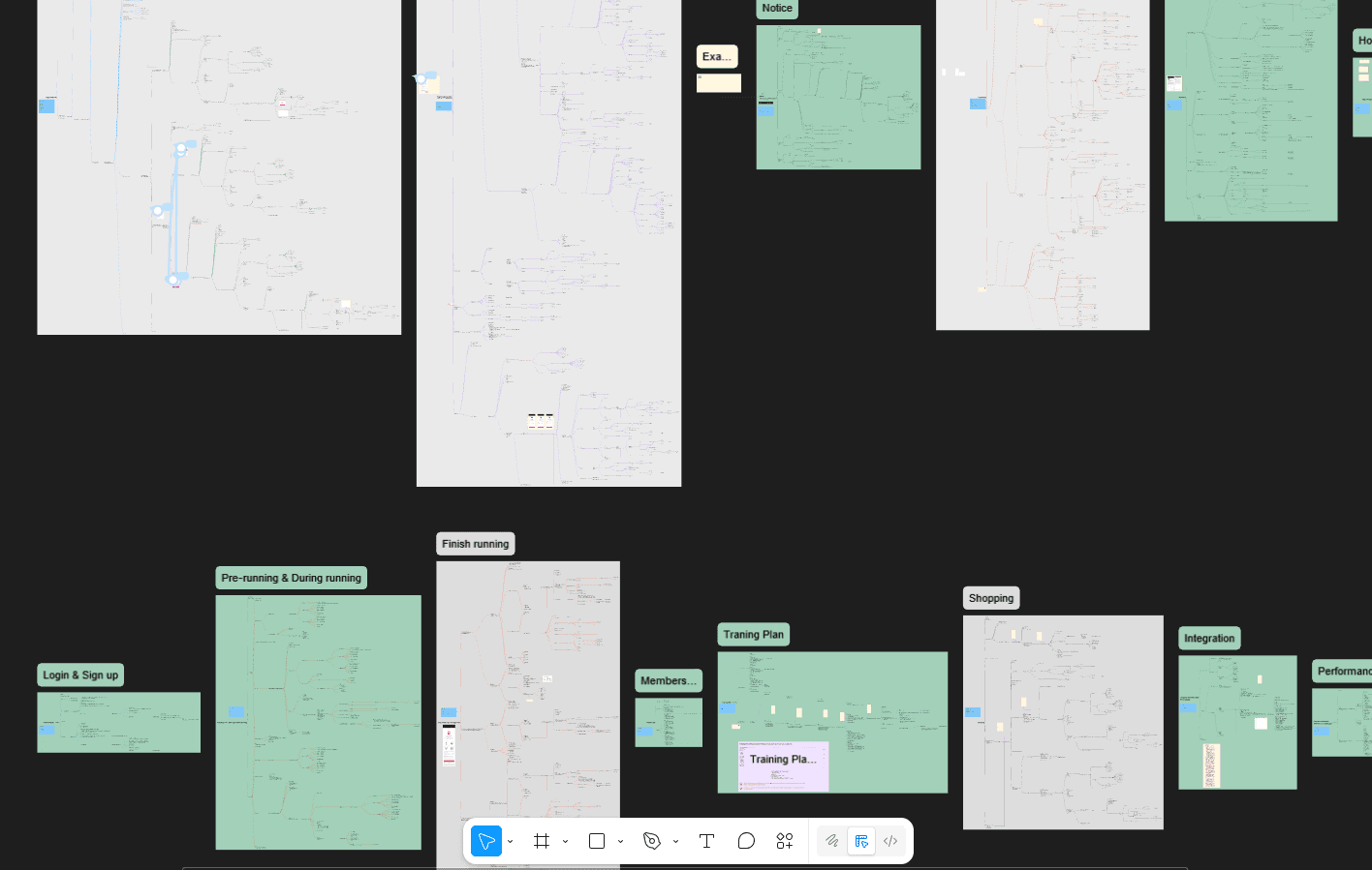
Information Architecture: Based on the research findings, we restructured the app's navigation and content, prioritizing features and information according to user needs.

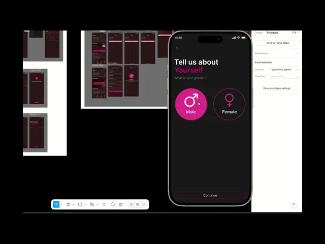
Wireframing & Prototyping: I designed low-fidelity wireframes to visualize the new layout and navigation, iteratively refining them based on user feedback. Afterward, we built a high-fidelity, interactive prototype to test the design.

Visual Design & Style Guide: I developed a cohesive visual language, including color schemes, typography, and iconography, ensuring consistency throughout the app. We also created a style guide to maintain design consistency in future updates.

Research & Analysis: We did compeitor analysis with apps like Nike running, Starva and adidas running and analyzed in-app analytics to understand the pain points and user needs. We also studied competitor apps and industry trends to gather insights to improve marathon plus

Information Architecture: Based on the research findings, we restructured the app's navigation and content, prioritizing features and information according to user needs.

Wireframing & Prototyping: We designed low-fidelity wireframes to visualize the new layout and navigation, iteratively refining them based on user feedback. Afterward, we built a high-fidelity, interactive prototype to test the design.

Usability Testing: We conducted usability tests with a diverse group of users to validate the design and identify areas for improvement. Based on the feedback, we made necessary adjustments to the design.

Visual Design & Style Guide: We developed a cohesive visual language, including color schemes, typography, and iconography, ensuring consistency throughout the app. We also created a style guide to maintain design consistency in future updates.

Design System (Marathon Plus)

The design system of Marathon Plus brings consistency and clarity across all screens. It defines the app’s visual identity with a bold, energetic color palette inspired by movement and health, paired with clean typography for readability. Components like buttons, cards, progress trackers, and icons were standardized for reusability. Spacing, grid systems, and responsive rules were carefully set for both mobile and tablet views.

Iterations
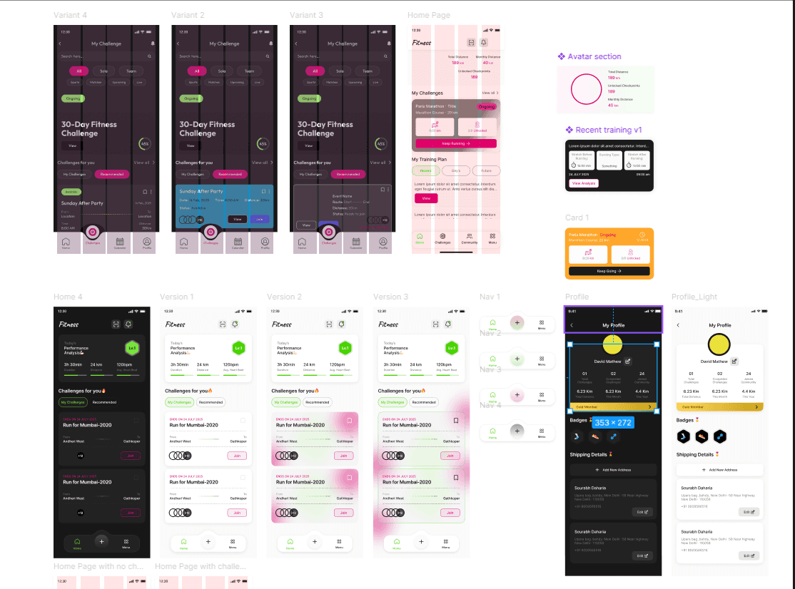
During the design process, I refined the interface based on usability considerations and layout improvements to make the experience more intuitive and efficient based on client and team feedback.

Marathon+ demonstrates how combining performance insights, community, and commerce can transform a utility app into an engagement-driven product. In early feedback, users found the stats dashboard overwhelming. We iterated by simplifying the hierarchy—highlighting key metrics first. Users then reported better clarity, improving their willingness to explore data.

Final Output (UI)

Conclusion

Marathon+ demonstrates how combining performance insights, community, and commerce can transform a utility app into an engagement-driven product.In early feedback, users found the stats dashboard overwhelming. We iterated by simplifying the hierarchy—highlighting key metrics first. Users then reported better clarity, improving their willingness to explore data.

Marathon+ demonstrates how combining performance insights, community, and commerce can transform a utility app into an engagement-driven product. In early feedback, users found the stats dashboard overwhelming. We iterated by simplifying the hierarchy—highlighting key metrics first. Users then reported better clarity, improving their willingness to explore data.

Create a free website with Framer, the website builder loved by startups, designers and agencies.