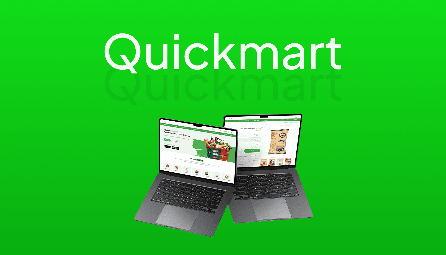


A Unified Grocery Platform for Retail & Wholesale Buyers. Increasing Order Value with Quickmart
QuickMart is a grocery e-commerce website designed to solve a critical market gap the lack of a unified platform serving both retail customers and bulk (wholesale) buyers. Increasing Grocery Order Value Through Bulk Pricing UX.
Platform
Website & Mobile (Future)
2.5 Months
E-commerce
UX/UI Designer
4+
Figma, Canva, Miro, clickup, chatgpt
Problem Statement/ Challenge
Grocery e-commerce platforms typically focus on individual consumers, neglecting small retailers needing bulk purchasing. This leads to friction: consumers want convenience, while wholesalers want transparent bulk savings. QuickMart aims to unify both, offering a clear, dual-mode experience.
Solution
Designed a dual-mode grocery platform (Retail + Wholesale) with visible bulk pricing and dynamic discounts to simplify decision-making.
Target Metrics
This project demonstrates how UX decisions can directly influence business metrics like conversion rate and average order value, even at the conceptual stage.
Target Users :
Retail Buyer
Shops for convenience
Makes low-to-medium quantity purchases
Wants speed and clarity
Wholesale / Kirana Owner
Buys in bulk (10–50 units)
Focused on margin and savings
Needs fast, repeatable workflows
Avg cart Value
₹800 to 1200 to ₹1400 (Quickmart target)
2.5-4%
Conversion Rate (Clear pricing reduces hesitation)
<45%
Bounce Rate (Faster decision clarity)

Process
Research & Analysis: I conducted user interviews, surveys, and analyzed in-app analytics to understand the pain points and user needs. We also studied competitor apps and industry trends to gather insights
Research (Qualitative)
6 informal user interviews
2 competitive analyses (BigBasket, JioMart-type flows)
Observational insights
Key Insights:
Small retailers often switch between multiple apps for bulk buying
Bulk pricing is not clearly visible or accessible
Checkout flows are often too long for repeat buyers
Information Architecture: Based on the research findings, we restructured the app's navigation and content, prioritizing features and information according to user needs.
Wireframing & Prototyping: I designed low-fidelity wireframes to visualize the new layout and navigation, iteratively refining them based on user feedback. Afterward, we built a high-fidelity, interactive prototype to test the design.
Visual Design & Style Guide: I developed a cohesive visual language, including color schemes, typography, and iconography, ensuring consistency throughout the app. We also created a style guide to maintain design consistency in future updates.
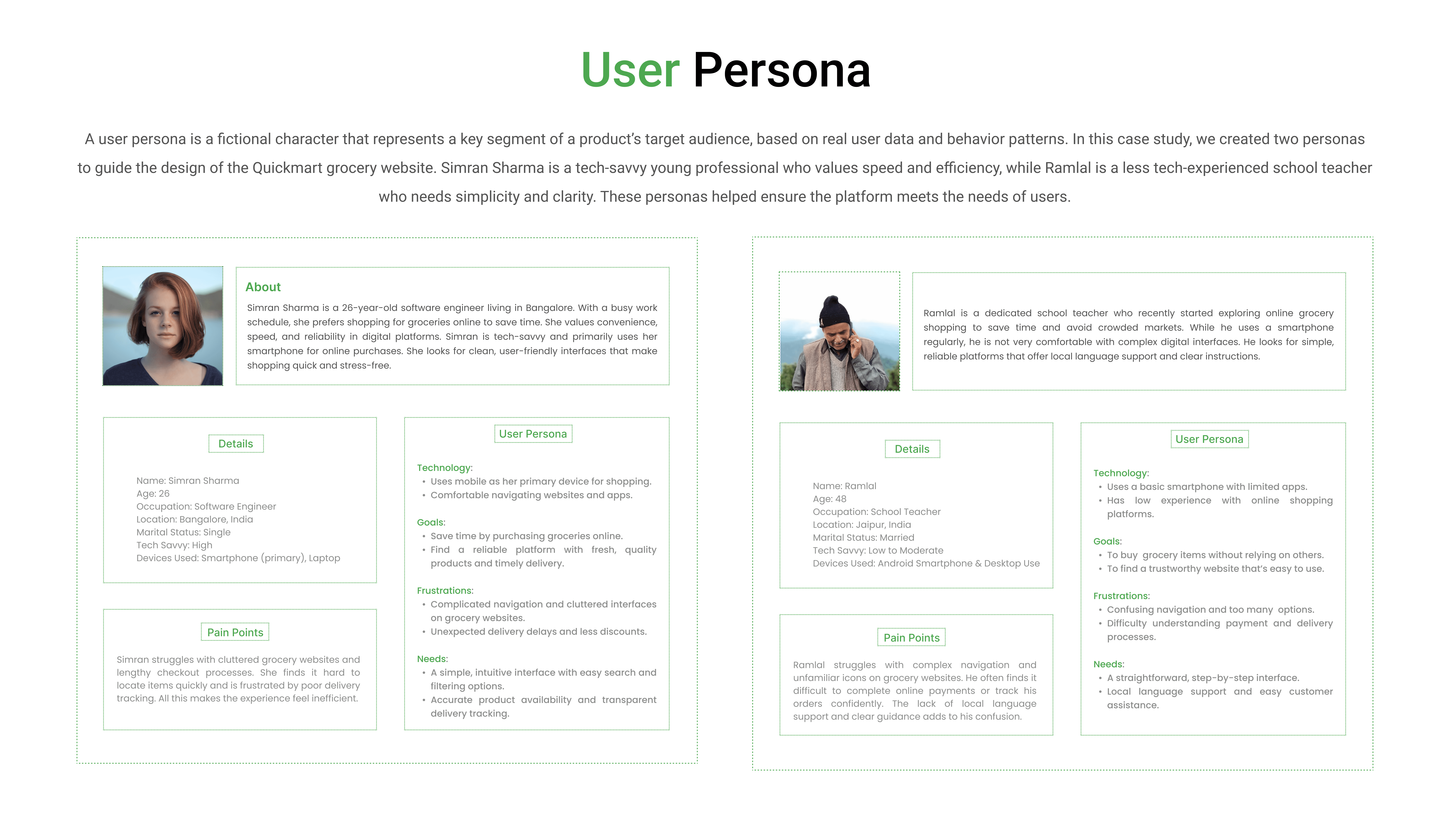


Design System (Quickmart)
For my grocery website project Quickmart, the design system served as a foundation to ensure visual consistency, usability, and efficiency across all screens. It included standardized components like buttons, colors, typography, icons, and layout grids tailored for a clean and intuitive shopping experience. This system helped maintain a better look and feel, making the design process faster while enhancing the overall user experience.


Final Output (UI)
Conclusion
This project demonstrates how UX decisions can directly influence business metrics like conversion rate and average order value, even at the conceptual stage.
Pricing clarity directly impacts conversion.
Bulk buying is a UX problem, not just pricing problem.
Designing for multiple user types requires clear separation, not complexity.
Expected Business Impact
Higher order value through bulk buying
Lower drop-offs due to clarity
Increased retention among shop owners
Faster purchasing flow